


RU:
Разработка визуальной айдентики для Multiply, компании, занимающейся разработкой программного обеспечения для клиник фертильности
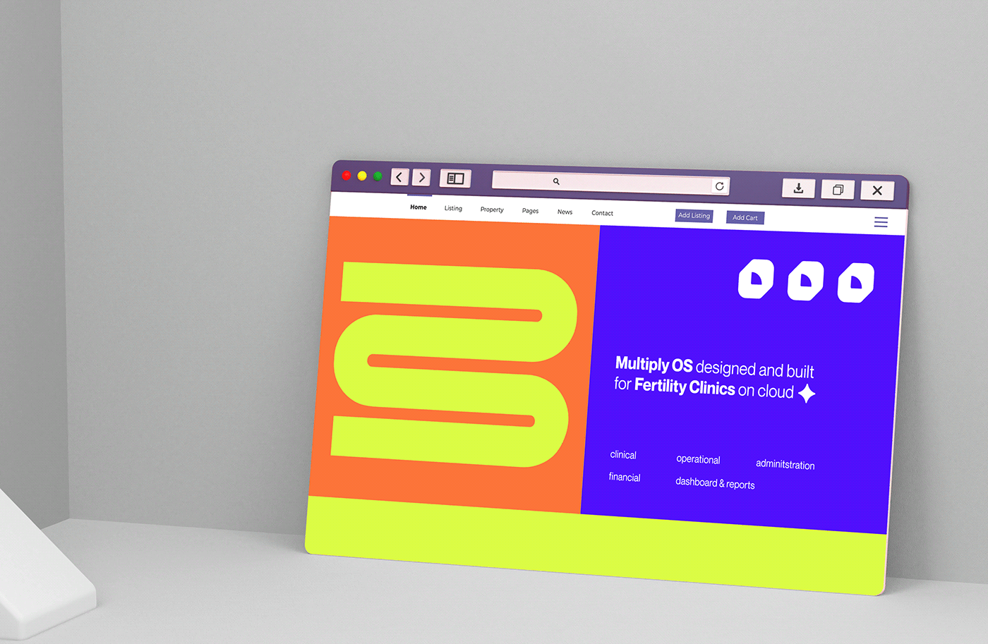
в США. В задачи входило разработать визуальную систему, применимую как для офлайн пространства (полиграфия, мерч), так и для онлайн - социальных сетей и сайта.
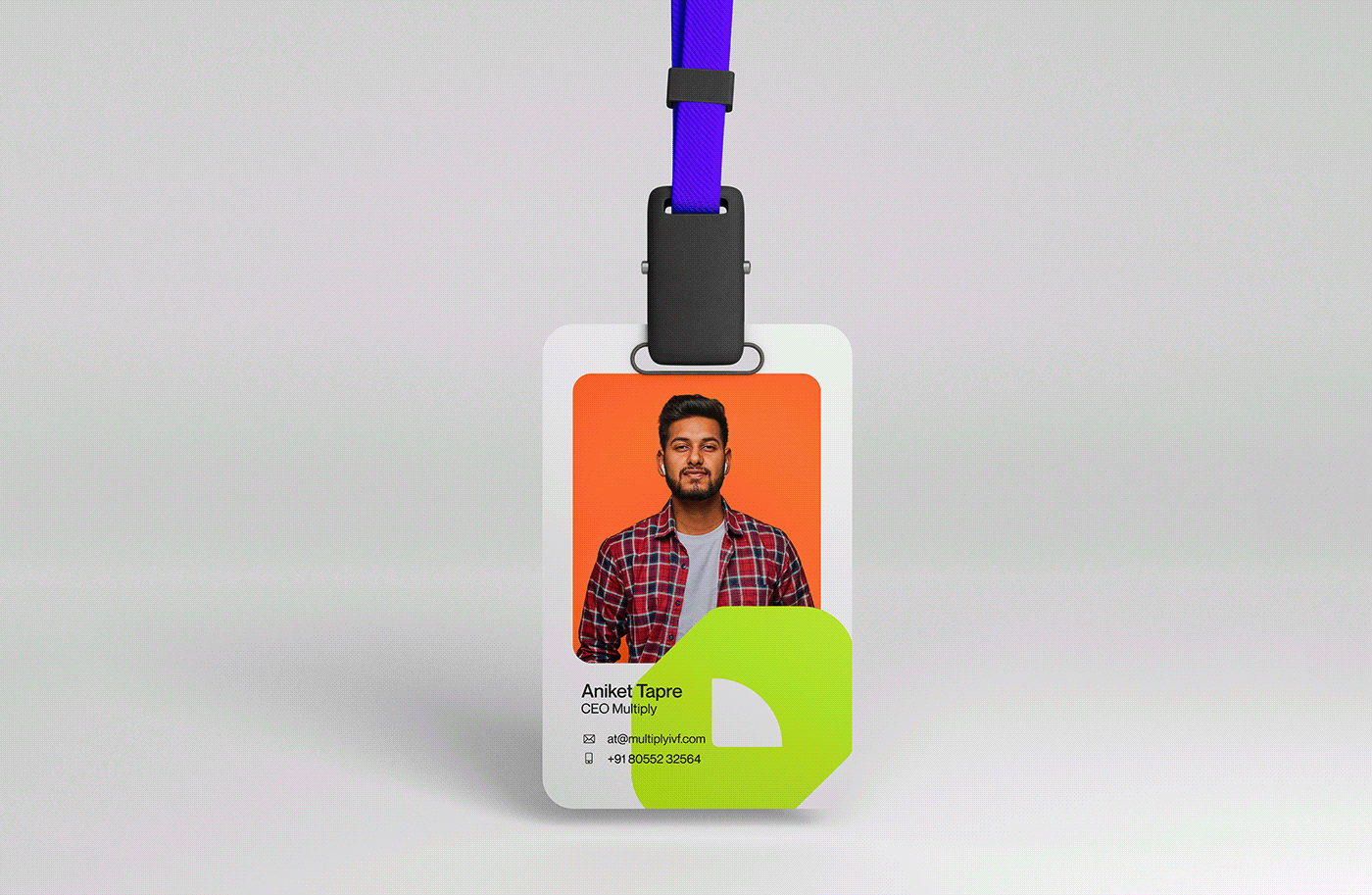
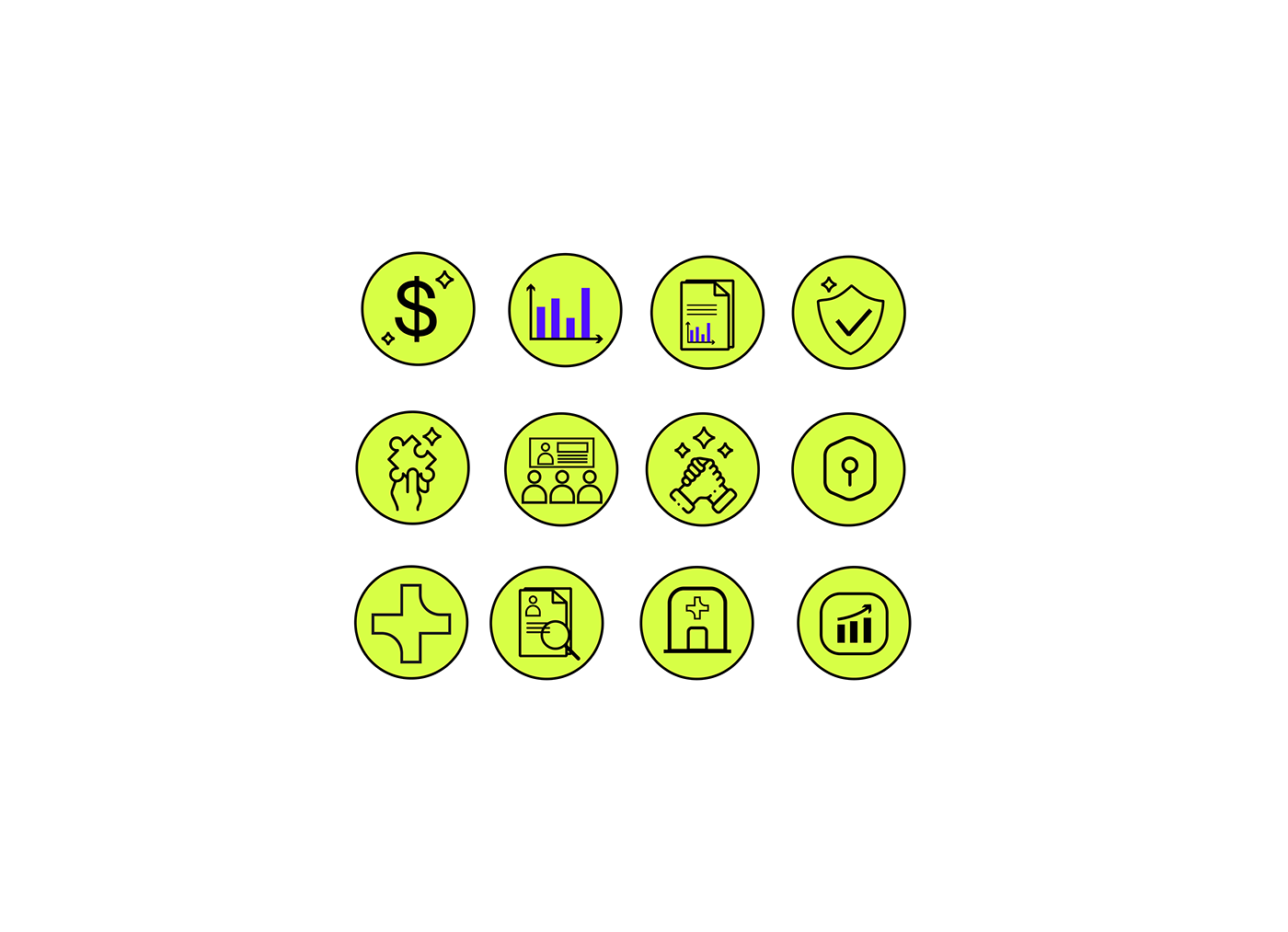
Решением стала разработка геометричной айдентики. Фигуры с динамичными формами призваны подчеркнуть системность и современность компании. Плавность форм демонстрирует принадлежность к помогающей сфере (клиники фертильности) и индивидуальному подходу. Прямые углы, а также яркая палитра из нескольких цветов символизируют системность и технологичность компании.
ENG:
Developing a visual identity for Multiply, a software company for fertility clinics in the US. The task was to develop a visual system applicable for both offline space (printing, merchandise) and online - social networks and website.
The solution was the development of a geometric identity. Figures with dynamic forms are designed to emphasize the systematic and modern nature of the company. The smoothness of shapes demonstrates the belonging to the helping sphere (fertility clinics) and individual approach. Straight angles and a bright palette of several colors symbolize the systematic and technological nature of the company.
поиск нужной формы фирменного знака / searching for the right form of the trademark


Art-direction and graphic design: Lera Rica
Motion design: Tatiana Mironova
Motion design: Tatiana Mironova
Contacts: lerarica.orders@gmail.com / telegram


